
“Mobilegeddon” is here! Is your mobile website up to it?
What’s Mobilegeddon All About?
If your website loads and performs well on the mobile phone, gives users a relaxing experience that helps them get to the page or information they want without hassles, if they don’t need magnifying glasses to read the content or separate the links you’ve mentioned, and they don’t have to keep scrolling to read all the content in the page, you’re safe. Well, isn’t that common sense, to make your website the most user-friendly, which we know Google rewards?
It is sense all right, but apparently not quite common since Greg Sterling of SearchEngineLand estimates that 40% of businesses and organizations do not have proper mobile-optimized websites. They inadvertently give mobile phone users entering their site a hard time, which is exactly what this April 21 “Mobilegeddon” update by Google is aimed at.
Google Wants Better Mobile User Experience
Google wants to make the mobile experience more user-friendly. Back in February 2015, Google, in its Webmaster Central Blog had revealed that it would be “expanding” “mobile-friendliness as a ranking signal” on April 21. The mellow wording basically tells that a major mobile-friendly algorithm change is going to hit.
Mobile search results could be significantly altered, all for the sake of users being able to find high quality and relevant search results optimized for their mobile devices. Not that this shakeup would surprise or shock only website owners. Users would probably not find their favorite sites at the top when they search on their mobile phones, though this update is intended at making them feel better.
Need for the Change
You couldn’t blame Google for thinking that way since it believes 50% of its searches come from mobile devices. Back in November 2014 it had announced the introduction of the “mobile-friendly” label to each of the mobile search results if they were mobile-friendly indeed, meaning optimized well for the mobile phone.
But the April 21 update is a major one which Google has admitted would significantly shake up mobile SERPs. So this algorithm change is expected to be bigger than the Penguin and Panda updates which is why the nickname “Mobilegeddon” is given to this, reminding us of the Biblical end of the world Armageddon war.
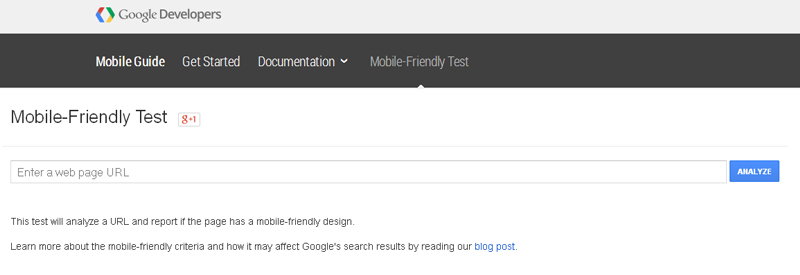
But it isn’t the end of the world for your site or business. You have ways to not only check whether your website is mobile-friendly but also to set the issues right. Google provides the Mobile Usability Report and Mobile-Friendly Test as part of its webmaster tools. It also gives clear guidelines on what it expects from a mobile-friendly site.
Preparations and Measures You Can Take
If you’ve identified issues, there are ways to set them right before you suffer too much. You can contact you local host since hosts provide ways to quickly create mobile versions of websites. Bluehost and GoDaddy offer such solutions. Professional SEO services would have many solutions in their arsenal to improve your mobile site sooner.
And while you’re doing that, Greg Sterling suggests that you update your business information in local directories such as Google My Business and Yelp, since many visitors to local business come that way rather than through the search results. This can help you strengthen your position while you make your website more mobile-friendly and better performing at the mobile search results.